Ever wonder what 1em or even a 1rem means when you are looking at your WordPress theme’s stylesheet and thinking what the hell is that? Normally when we look at font sizes, many people often think of pixels (px) as a unit of size. In the past, this was the standard…until we started evolving into accessibility. So what I will do here is give a simplified description of the differences between em, rem, %, and px, but I will try not to get too technical to descibe it.
Just What is EM and REM?
EM and REM are known as relative units.
- EM = 1 em is the equivelent to the width of the capital letter “M“
- REM = 1 rem is the Root (body) equivelent to the width of the capital letter letter “M“
Of course, reading that sounds technical, so I will give you an better definition of each one.
Start with a Main Body Font Size
Theme developers usually start our webpage with a default font size of 100% which translates to 16px. This is our starting point, a foundation or root size. When we make a web page with several paragraphs of text based content, this means that every paragraph will be 16px in size.
EM Size
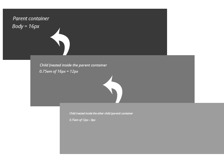
With a main body size of 100% (or 16px), let’s place 3 paragraphs inside a container. The em size will be a relative size of the parent element it sits in, so this case, it’s the main body size of 16px. So for example, we will create a box and put 1 paragraph inside of it and let it inherit the same size as our main body size of 16px. Then, inside that box, we will add another box with a paragraph, but this time we will make this box font size to be 0.75em. After this, we will add a box with a paragraph inside that one and we will make the font size to be 0.75em as well. Next, we will add yet another box with a paragraph inside that one, and once again, we will make that one with a font size of 0.75em as well.
This is how it will look in your web page when we start with a base font size of 100% (16px)
Default Font Size - Lorem ipsum dolor sit amet, consectetur adipiscing elit. Praesent ut eros quis dolor viverra fringilla. Pellentesque sed lacus quis elit suscipit egestas vitae nec lorem. Phasellus felis leo, dignissim in maximus et, euismod sit amet quam. Praesent iaculis felis vitae orci volutpat, quis rhoncus lacus semper.
Font Size is 0.75em - Lorem ipsum dolor sit amet, consectetur adipiscing elit. Praesent ut eros quis dolor viverra fringilla. Pellentesque sed lacus quis elit suscipit egestas vitae nec lorem. Phasellus felis leo, dignissim in maximus et, euismod sit amet quam. Praesent iaculis felis vitae orci volutpat, quis rhoncus lacus semper.
Font Size is 0.75em - Lorem ipsum dolor sit amet, consectetur adipiscing elit. Praesent ut eros quis dolor viverra fringilla. Pellentesque sed lacus quis elit suscipit egestas vitae nec lorem. Phasellus felis leo, dignissim in maximus et, euismod sit amet quam. Praesent iaculis felis vitae orci volutpat, quis rhoncus lacus semper.
As you can see from the example above, each box with text in it, uses the same 0.75em size while each box sits inside the previous box, but even though each one is using the same 0.75em size, they are getting smaller and smaller. What is happening, is this:
- The first box with content inherits the base font size of 100% (16px) because the webpage body is the parent.
- The second box with content has a font size of 0.75em applied to it which is relative to the 100% (16px) base size, so we get an equivelent of 12px.
- The third box with content nested inside the second one has a font size of 0.75em which is now relative to the 12px the second box has. This means that 0.75em is using the 12px of the second box as the parent, so now the font size is using 9px as the font size.
In a nutshell, what happens is that the font size is relative to the parent that it sits inside of and not the webpage base font size. Any element that is nested inside another element will base its size on the parent element it sits in. Here is a graphic to show the nesting:
It gets quite confusing when you have a webpage that has a lot of content and each element is nested in other elements while elements might not be nested. In the second box above where it shows the font size result is equal to 12px, but you want the third box that is nested in that one to also be 12px, you have to now make that font size as 1em so that it equals 12px. Still confusing I know and does get messy with the more content, the more em sizing, the more nested content you have.
My Favorite REM’s
Similar to em’s, the rem unit is my favorite because it makes it much easier to manage font sizes, or for anything you apply the em or rem unit to. For example, it’s not just for fonts, it can also be used for padding, margins, line height, even widths.
REM is based on the “root” of your page size that is set with the HTML or Body tag in your stylesheet. I mentioned that the HTML or Body usually has a default size of 100% (16px) to start you off with. The rem unit will always use either one that is set, regardless where it’s being used in your page and content because it’s not relative to the parent element like our em unit it. Let’s see this visually as we apply the same layout as before with em’s but this time we will use rem’s for our font size:
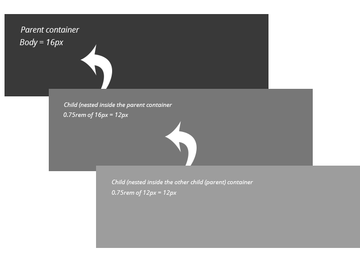
Notice how the two nested boxes with content have the same font size? This is because both are using the body root size of 16px as our parent baseline. No matter how many nested elements you have with different sizes, each one will use the body baseline of 16px. Wherever you have 0.75rem, it will always equal 12px. Likewise, if you used 1.25rem, this will always give you 20px (the equivelent of 1.25rem).
Making It Easier
I will make this even EASIER for you so that when you are making size adjustments in your theme using the “rem” unit, you can use an awesome online conversion tool called “Px to Em” that lets you easily convert em’s to pixels, pixels to em’s, and even percent (if you prefer to use percent). However, you might notice that is shows only em units and not rem units. Because they are almost similar, whatever px value you want to convert, this will still work. For example:
- 16px = 1em = 1rem
- 24px = 1.5em = 1.5rem
- 36px = 2.25em = 2.25rem
Why Use Relative Sizes?
As quoted from the pxtoem.com website by its creator, Brian Cray, “Accessibility is increased for end-users because text is scaled based on their preferences rather than set statically in pixels. Additionally, end-users can use hot keys to scale the text in all browsers. Many people have difficulty reading small text on a computer screen.”
In other words, if you are visiting a website and the text is too small to read, you can use your browser or keyboard hot keys to enlarge the screen text. If your webpage uses pixels (px) for font sizing, the text will not resize because pixels are static — means they will not change.
How to Apply Em or REM to your Fonts
I mentioned before that you can use these units for more than just font sizes, but for the sake of font sizing, most people have been doing this:
.my-title {
   font-size: 14px;
}
But that is a fixed static size, so we need to change it to be relative.
.my-title {
   font-size: 0.875em;
}
…or for rem:
.my-title {
   font-size: 0.875rem;
}